Credit Card Reader
ergonomic & research study 2025
Team:
Rebecca Ko - field research, prototyping, ideation, CMF, Keyshot, CAD (fusion 360, rhino), vizcom, industrial design
Laura Rubin - field research, UI display screen, graphic design
Jorge Valenzuela - field research, UI display screen, graphic design
Goal:
Research and prototype to solve and identify paint points in credit card readers. Gather unbiased user feedback to create possible solutions to solve the problem. Collaborate with other design fields.
Design:
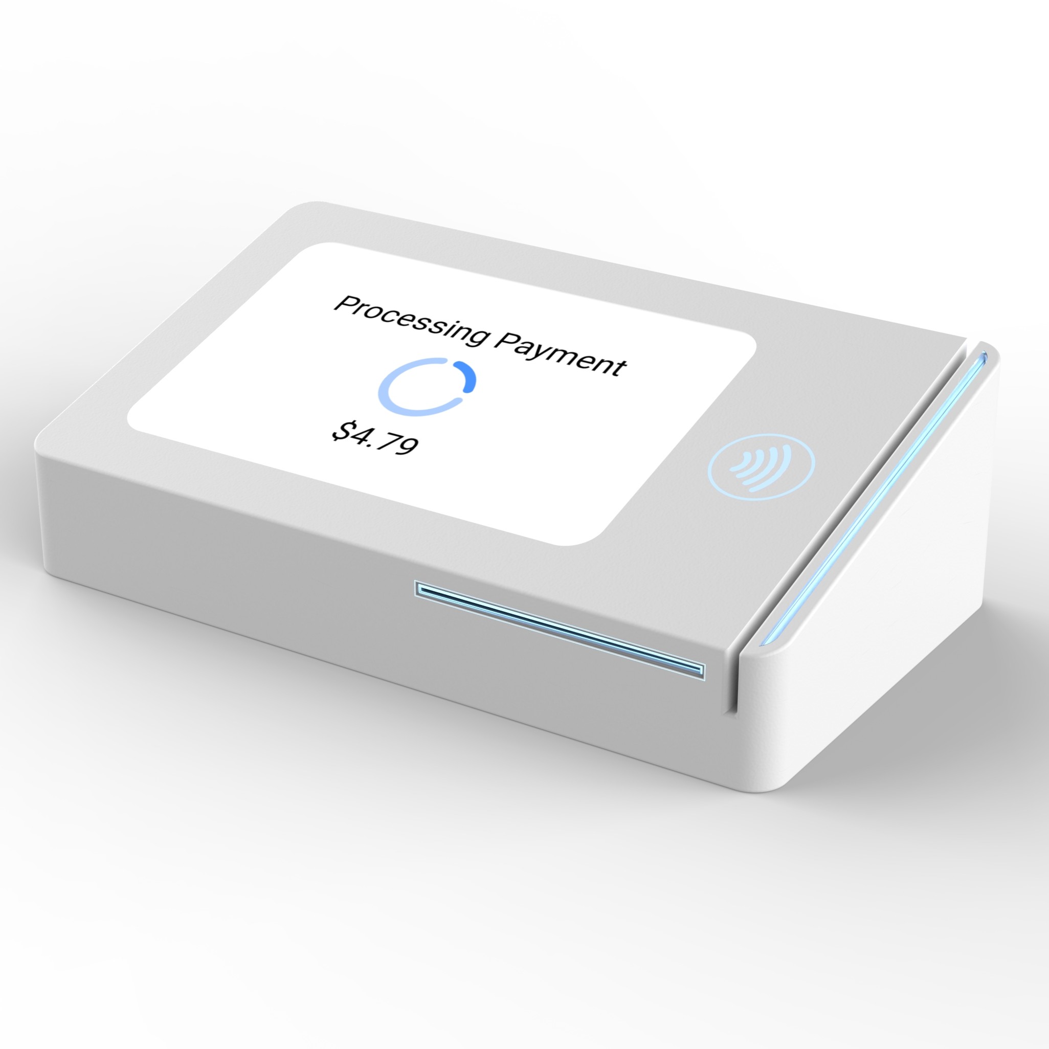
An improved credit card reader that solves the repeated issue users face with existing designs. A focus on intuitive design.
")
")
")
")

")
")
User background from field research.

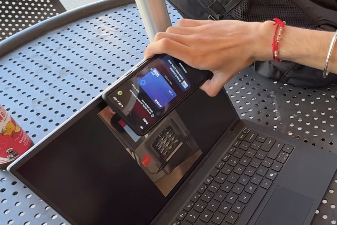
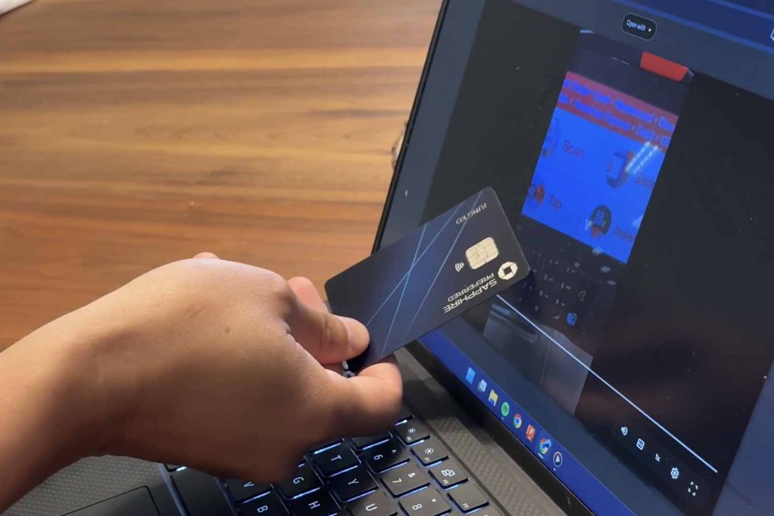
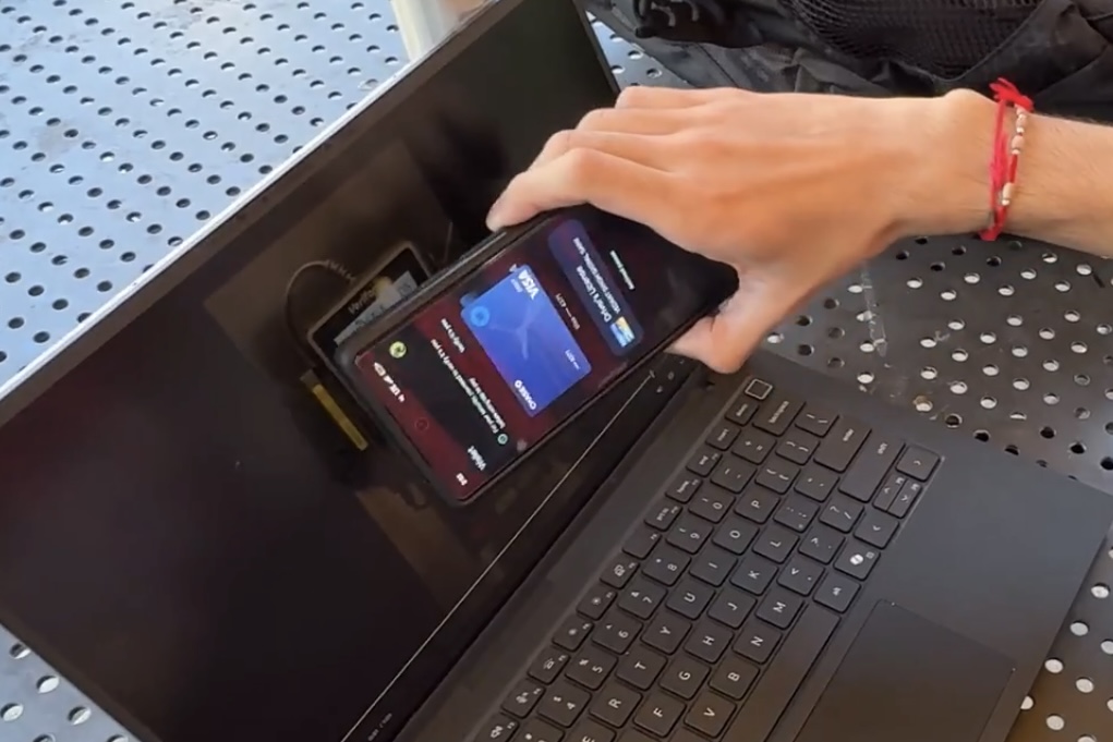
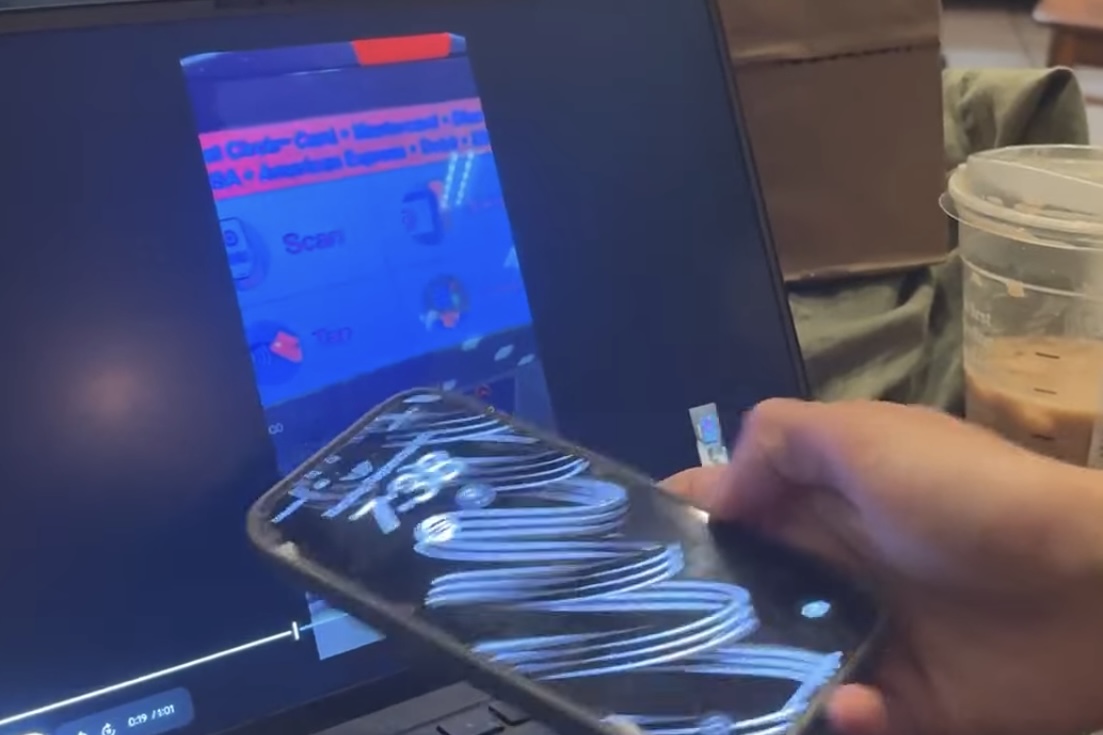
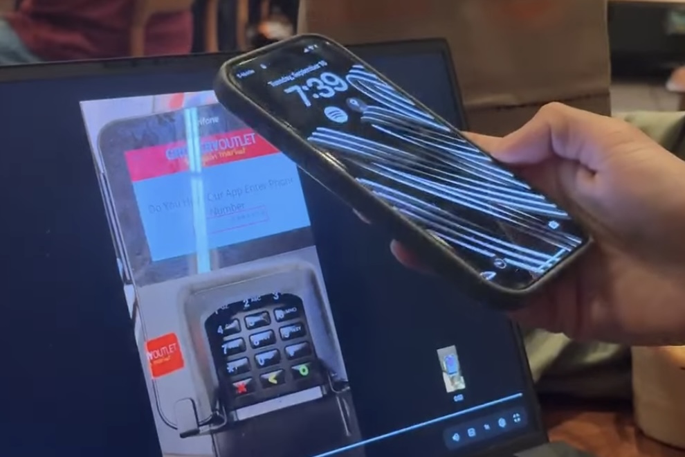
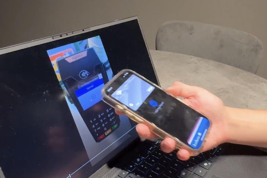
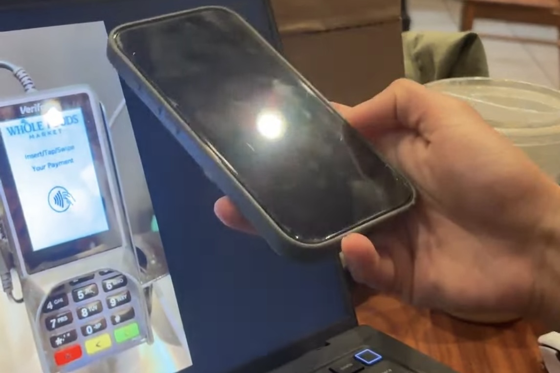
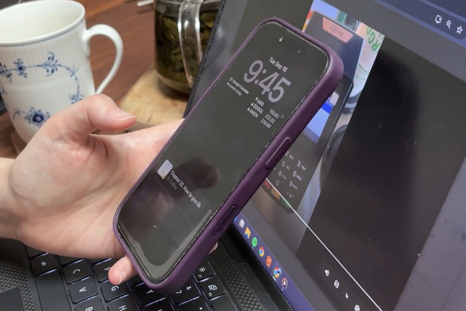
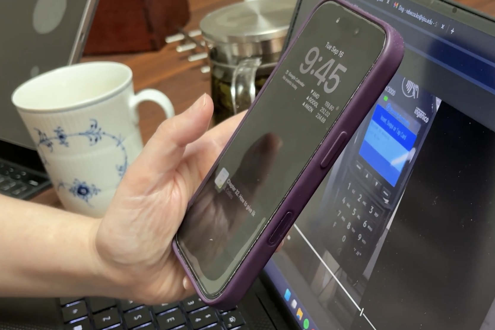
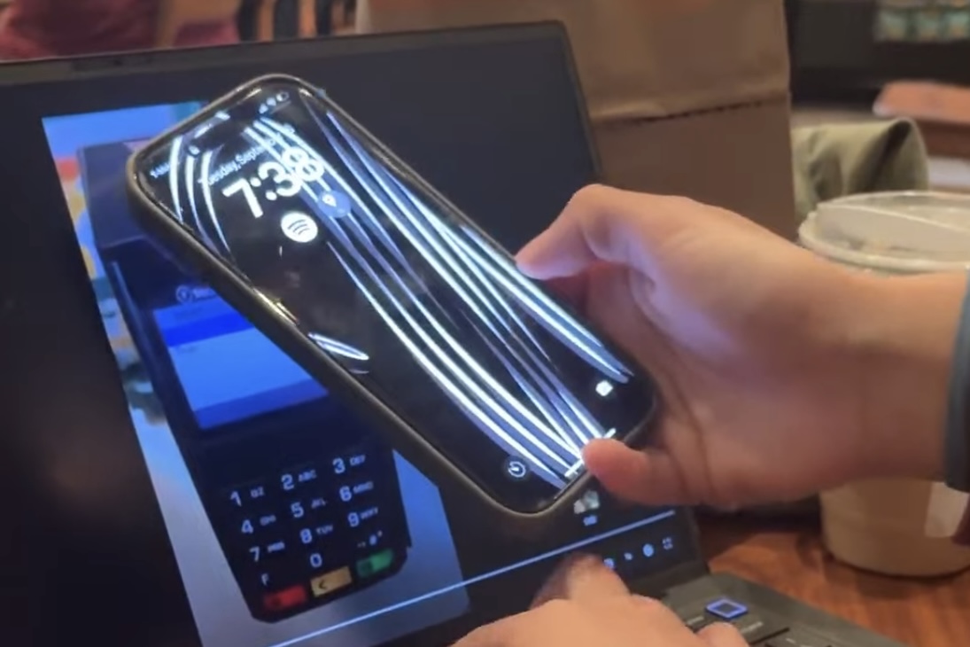
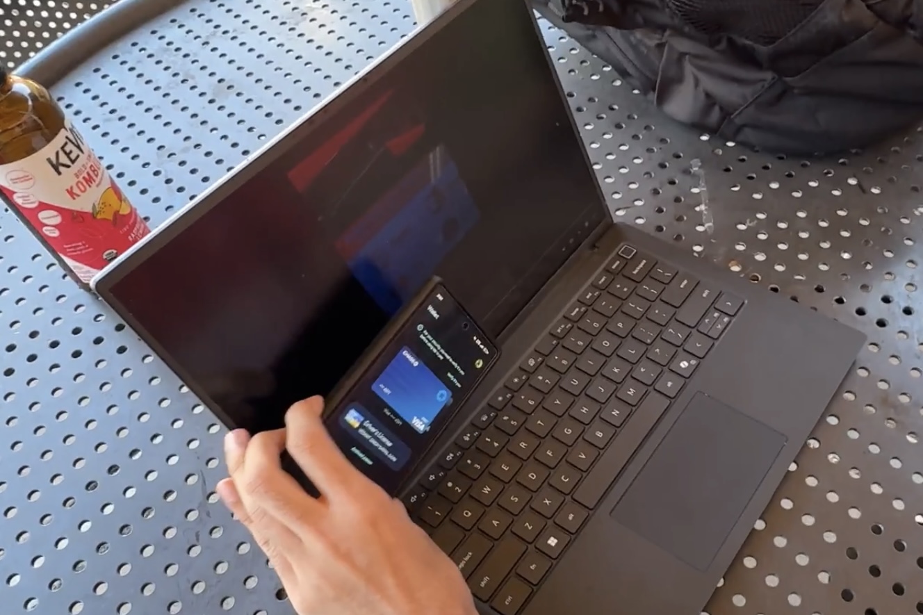
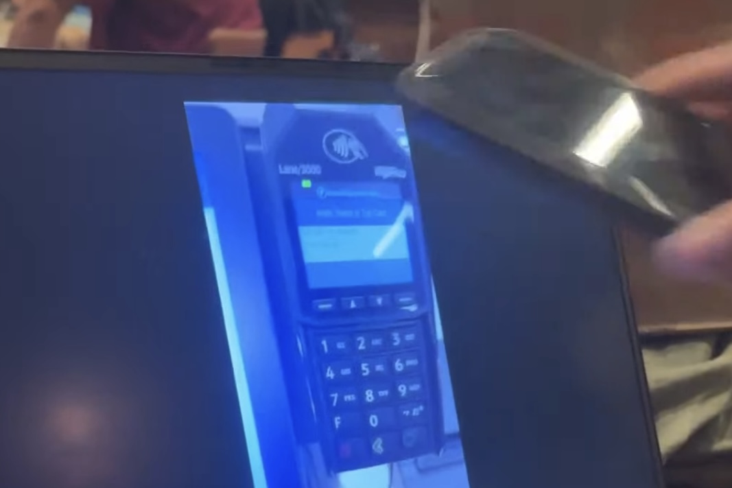
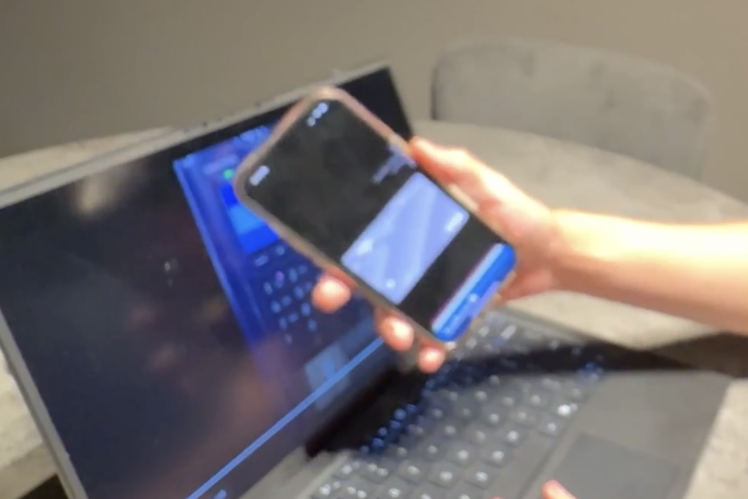
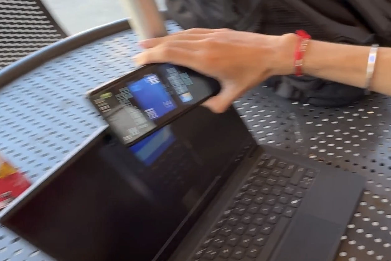
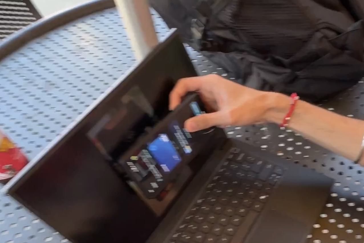
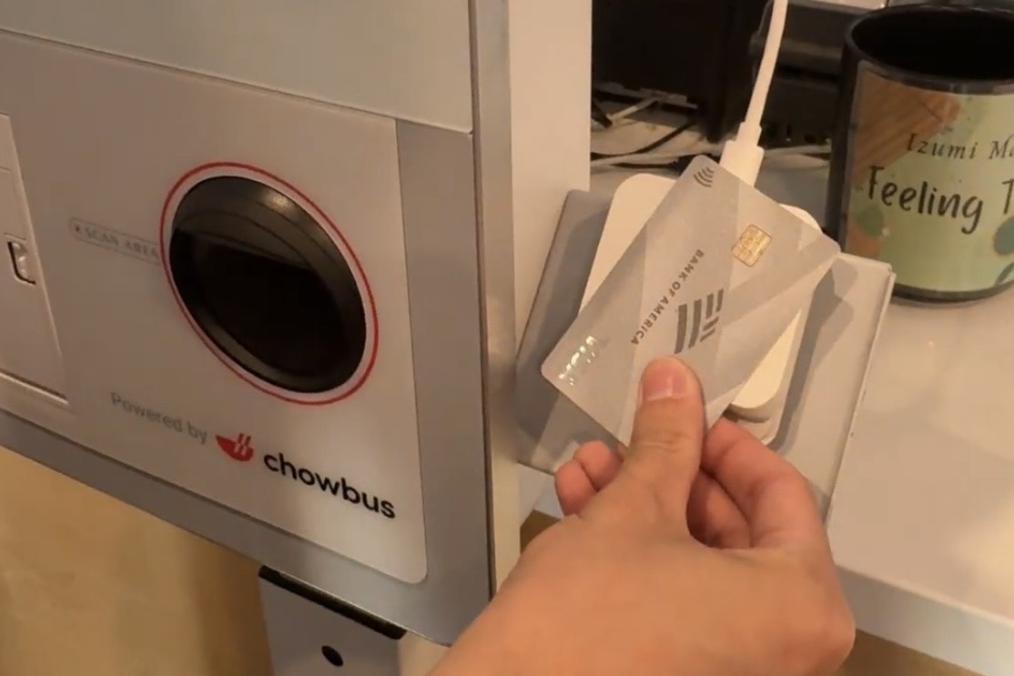
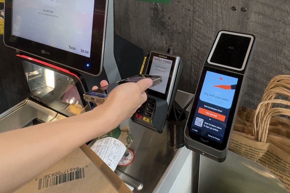
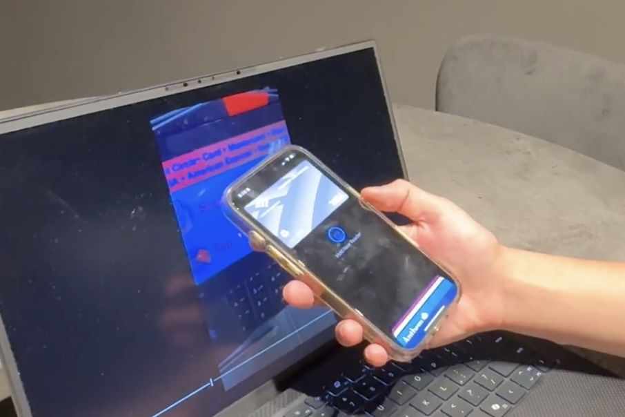
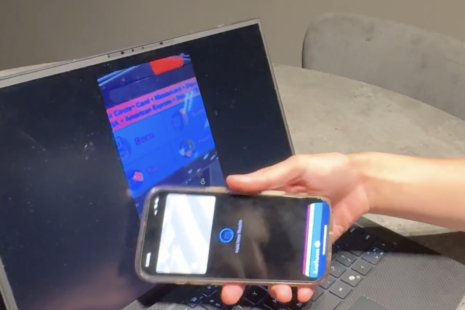
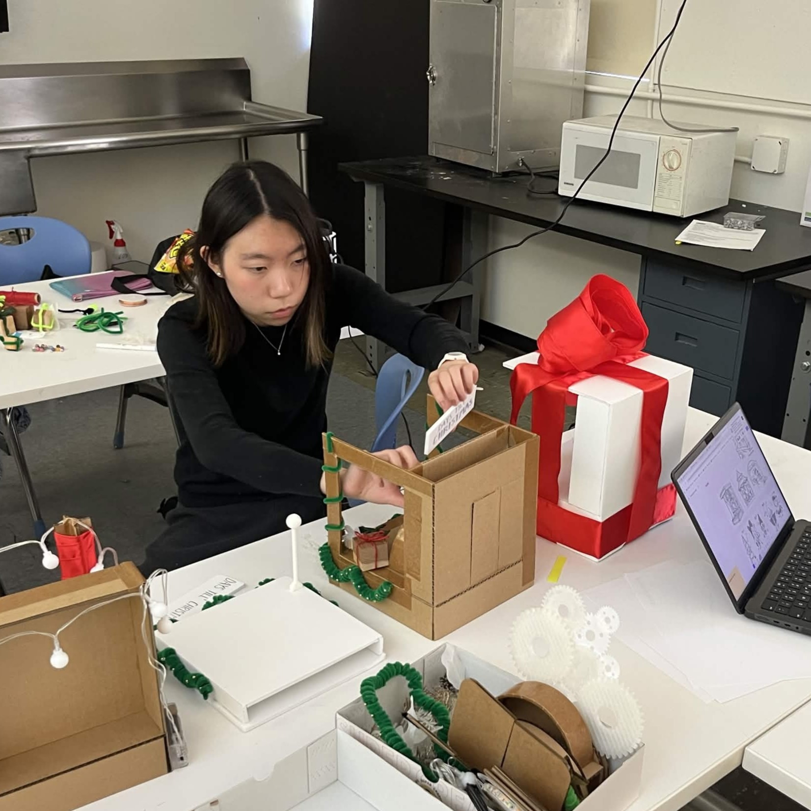
Due to schedule restraints and other factors, we could not bring all users to multiple stores for testing. Users mimic 5 ccr transactions on a screen with realistic sounds and feedback as if they are in the store themselves. The video stops, and users tap their device on the part of the device they think will successfully process the payment. The video will not resume until users tap the correct areas, which simulates possible error messages. Followed with online survey and interviews.
Interview with Abby, a cashier (also a graphic designer), shared her insights on readers at her store, and common pain points for customers. This information helped guide our next steps.
Notes from a participant (Abby) in round 1 & 2 (images below).


Some participants corrected themselves after thinking aloud. "At first the bright red color drew me to the top, screen, but afterwards I saw the logo on the bottom left and realized I was wrong" (p4).

")
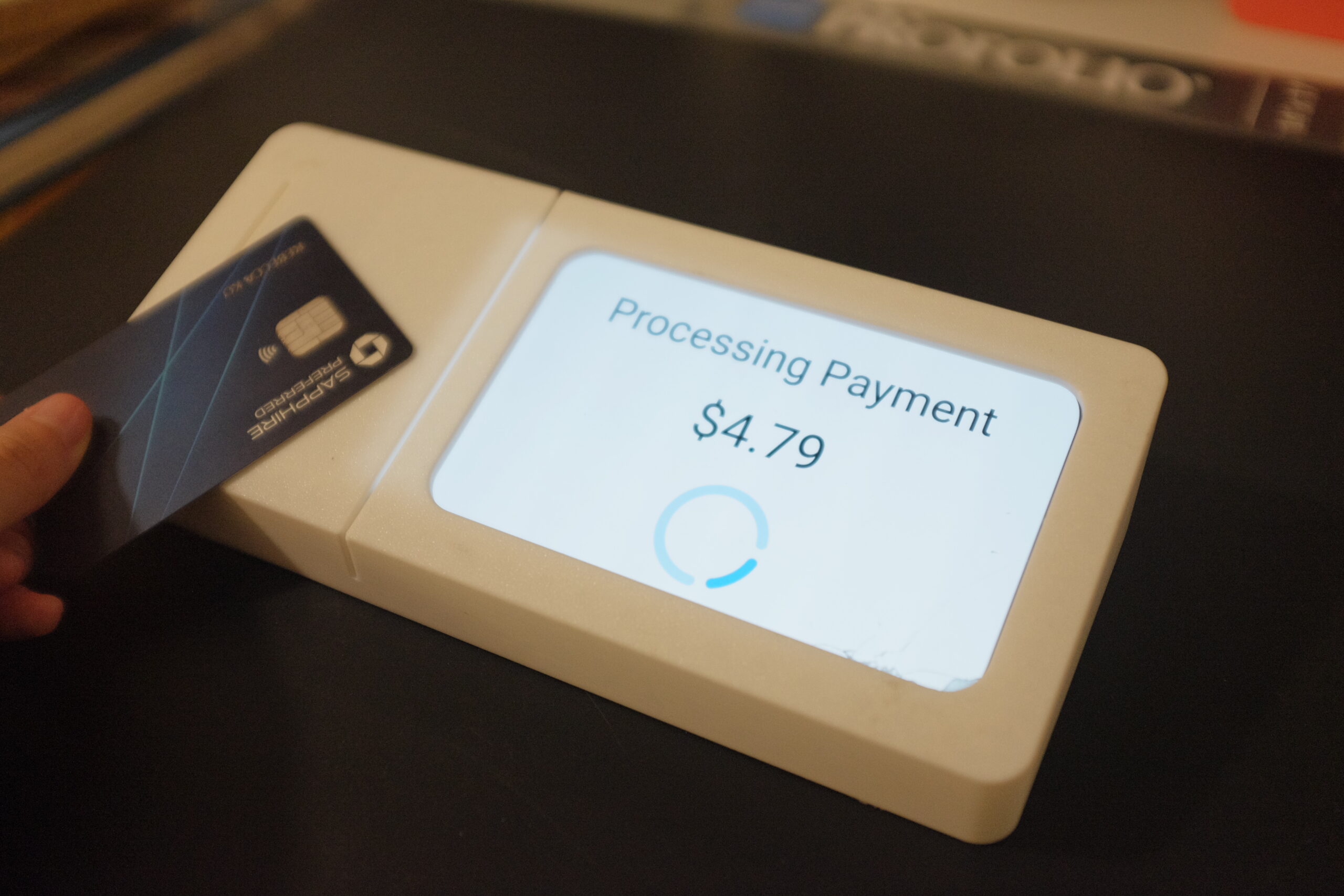
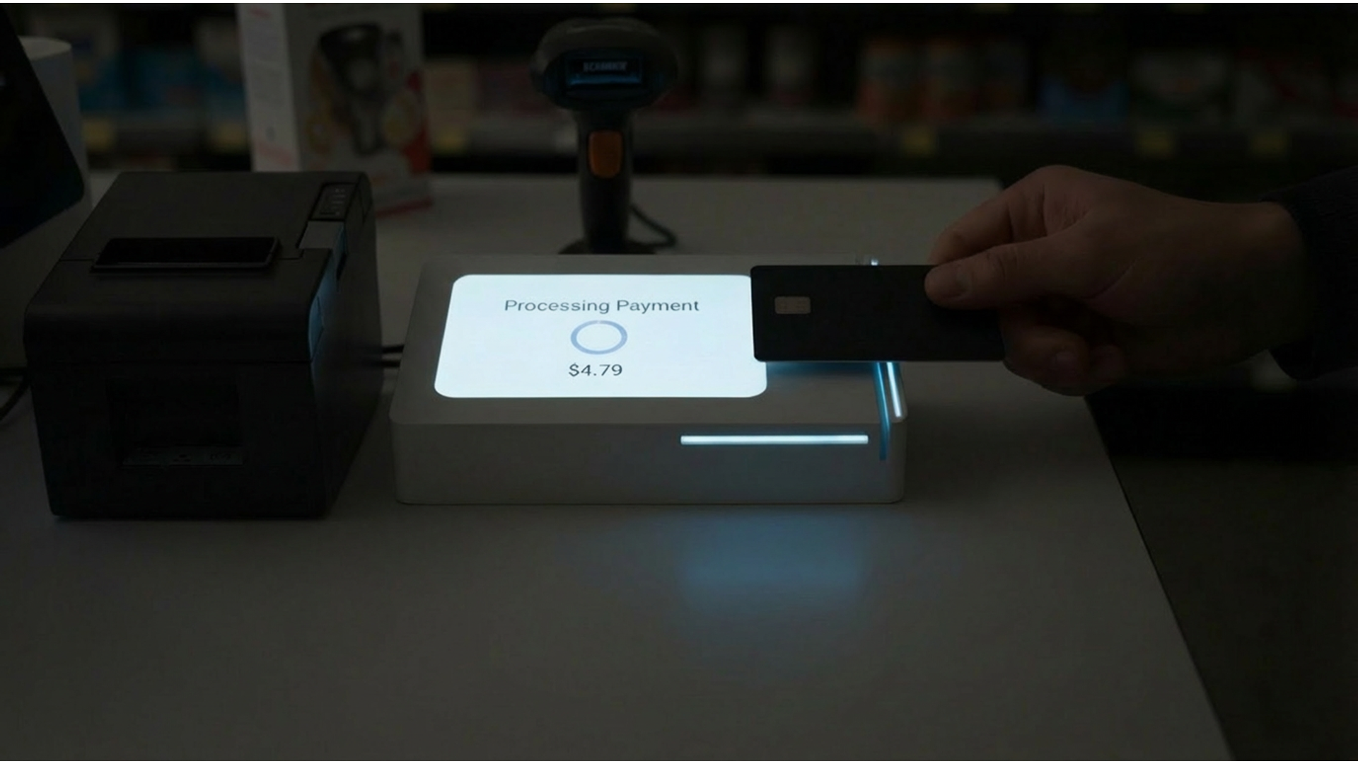
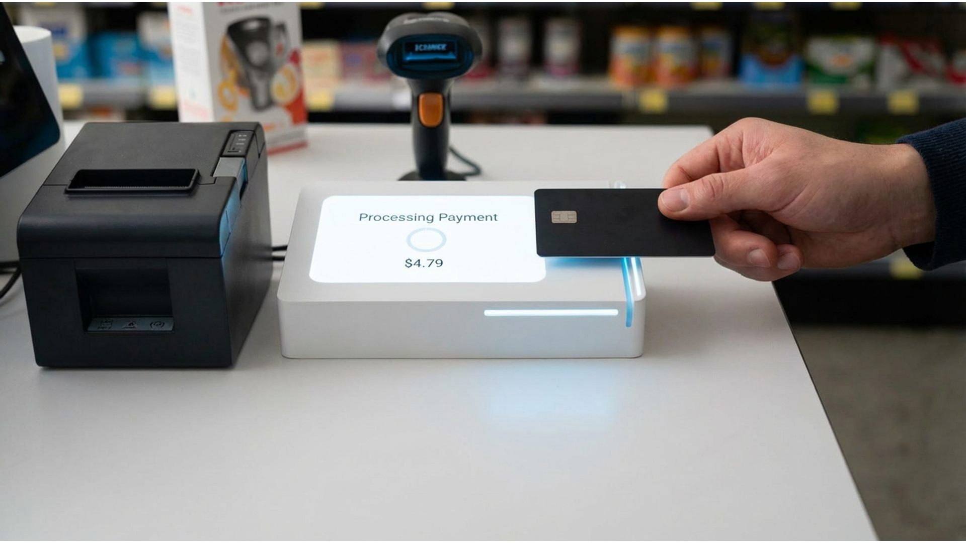
Based on field research, users found certain models hard to navigate, due to lack of clarity in the interface or housing that made it hard to interpret where to tap to pay. Most users expressed that the main functions of a good card reader is how easy it is to know where to pay in as little time as possible. This meant that the product needs to be clear of its function as soon as the user starts the transaction. Users recorded that the universal tap to pay icon is neccessary to always be shown, as well as a simplified design that elimiates distractions. This minimizes visual fatigue and allows users to make decisions intuitvely. I explored concepts that highlight the tap to pay logo, through devices such as levels, lights, angles, and visual weight to guide the user to the correct location.
I practiced how to gather appropirate unbiased data, and used the information to iterate designs that could potentially solve the users problems.
")
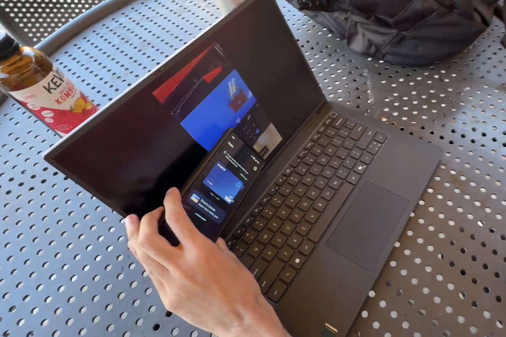
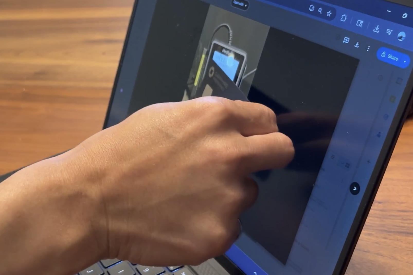
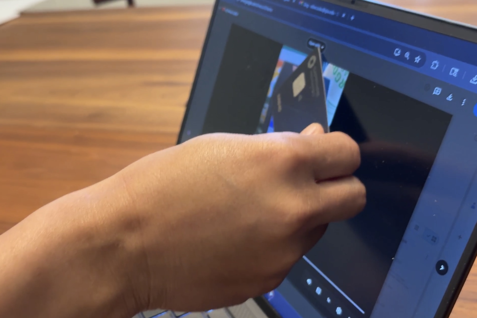
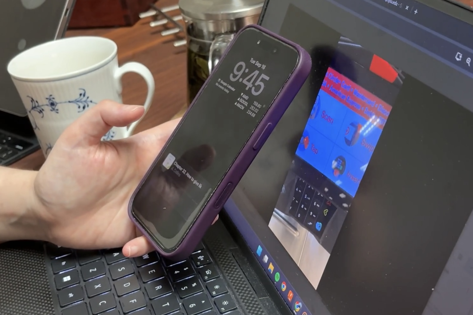
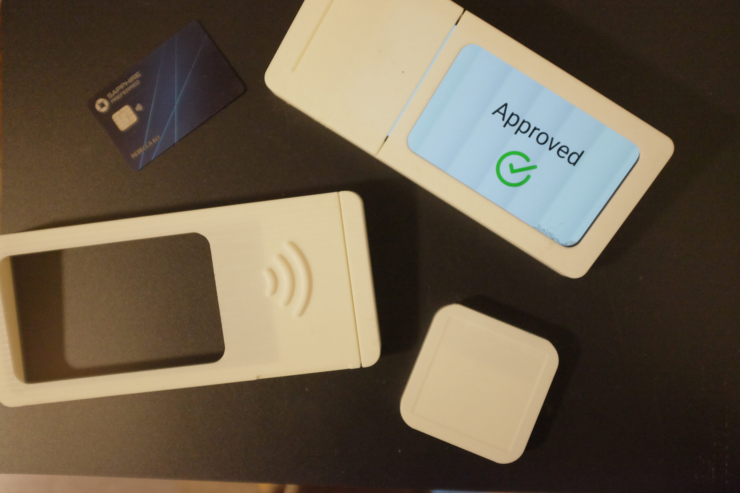
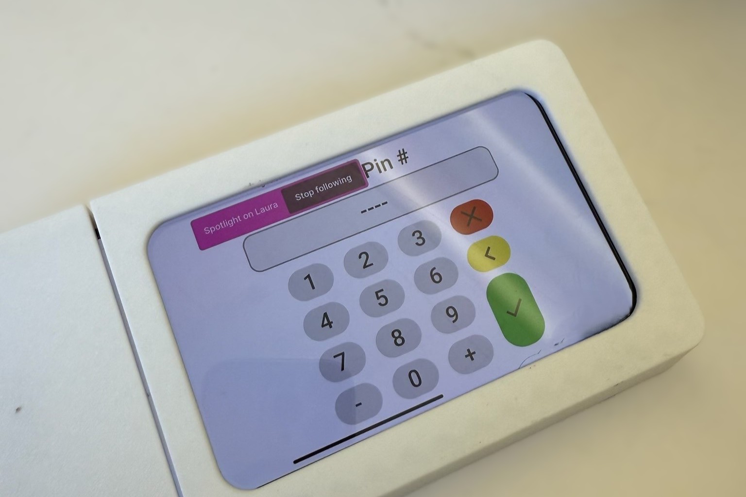
Mockups with working screen for graphic designer's prototypes.
")
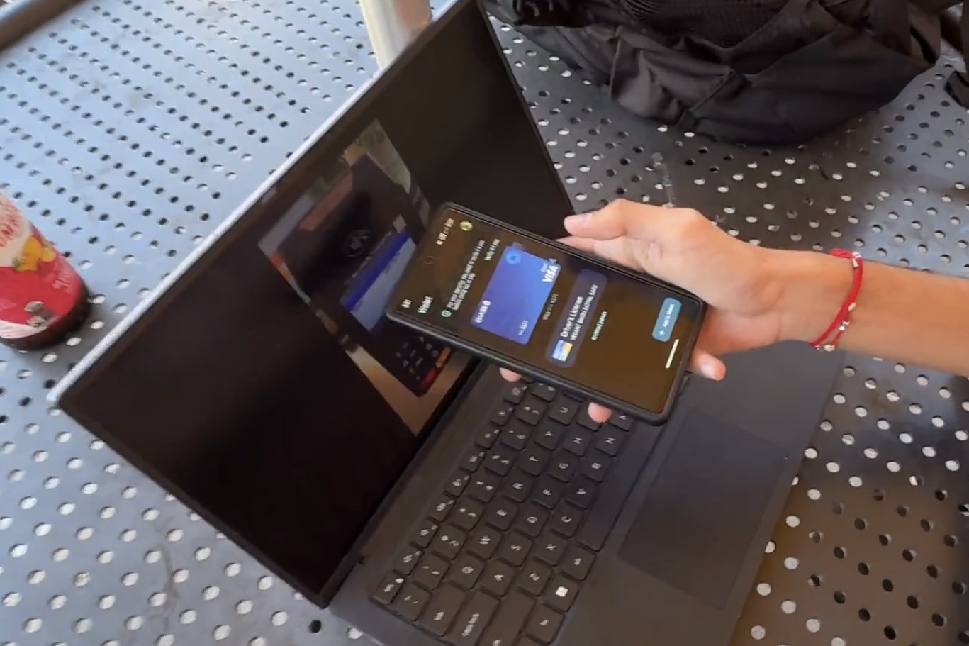
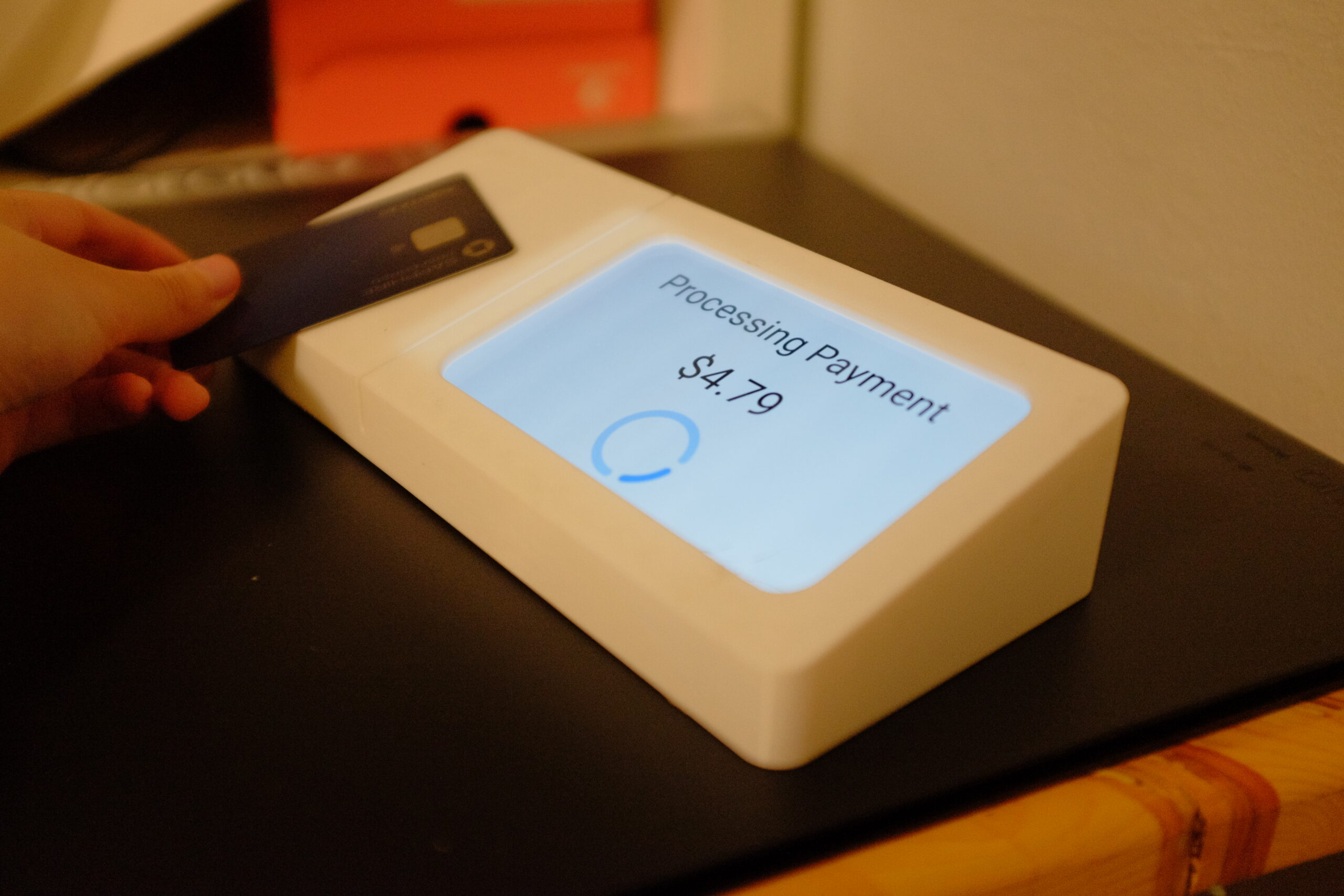
Users were brought back for a 2nd round of testing, this time for our prototypes. Users participated in using the housings in a mock payment. Figma changed the UI screens according to which part of the payment process they were in. Surveys, interviews, feedback, and user generated ideation (shown below) were conducted.
")
Formative evaluation:
1. Horizontal reader, screen on left with a 33° angle as the most intuitive for the majority.
2. Fonts ~ pt 20 is widely preferred than original card reader interfaces.
3. An external number pad tends to slow down transactions and creates visual confusion in general. A digital number pad is sufficient.
4. Most users immediately gravitate towards a backlit, tap-to-pay logo and understand it's function.
5. Neutral CMF gives clarity over bright colors.
")
")
“The horizontal one with the medium (33°) is very clear where I need to tap. The logo helps too.”
-p14
“If the logo lights up and is flush to the surface I’ll know what to do automatically”
-p2
“I can see the text even without my glasses”
-p3
")


(1) How wide is the tap to pay landing, without being overwhelming and/or wasting material and space? Testing sizes were achieved through the width of a typical mobile phone and credit card. What size should it be in comparison to the payment device?
")
(2) backlight color. What color is best suited for this type of transaction?
")
Logo style and size.
")
")
")
")
 (1)")
Selected Works
Copyright © 2025-26 Rebecca Ko. All Rights Reserved.